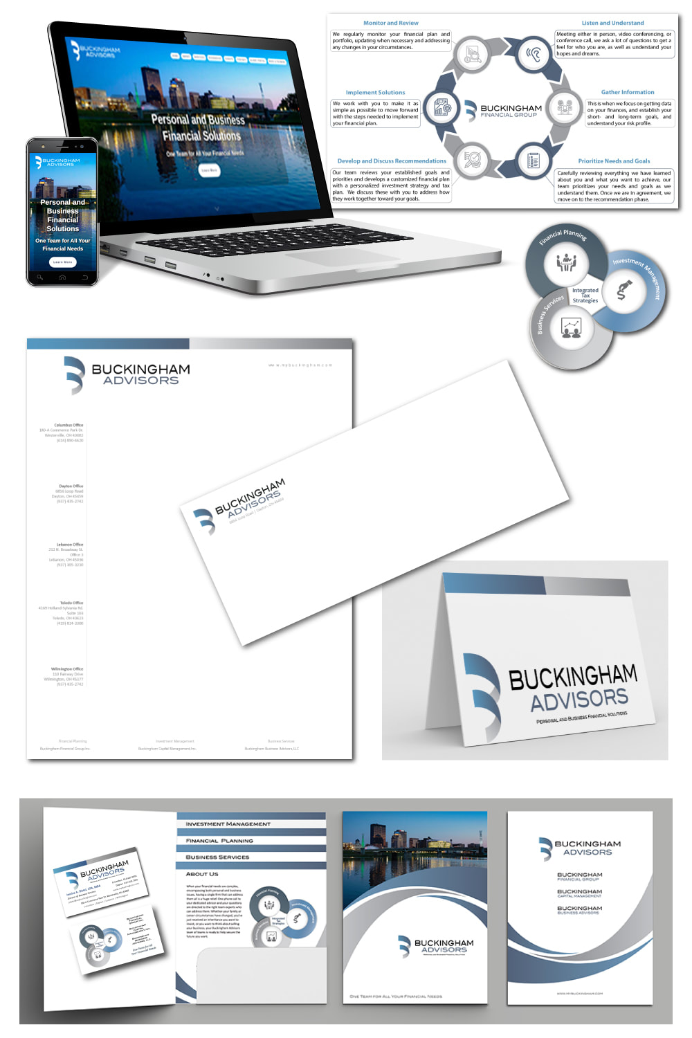
The professionals at Buckingham Advisors, with several locations in Ohio, asked Impact Communications to develop a marketing plan and to assess their future readiness. We determined that their collateral materials, website and social media needed a refresh. Using banner photos of well-known landmarks and Ohio countryside allowed us to reflect the beauty and "can-do spirit" of the region. We also showcase the firm's experience and expertise through a steady stream of multimedia and blog content. When you visit the website, you'll see how we are using all of their media coverage and thought leadership to create a halo effect and strong SEO for the firm. Visit the website here.
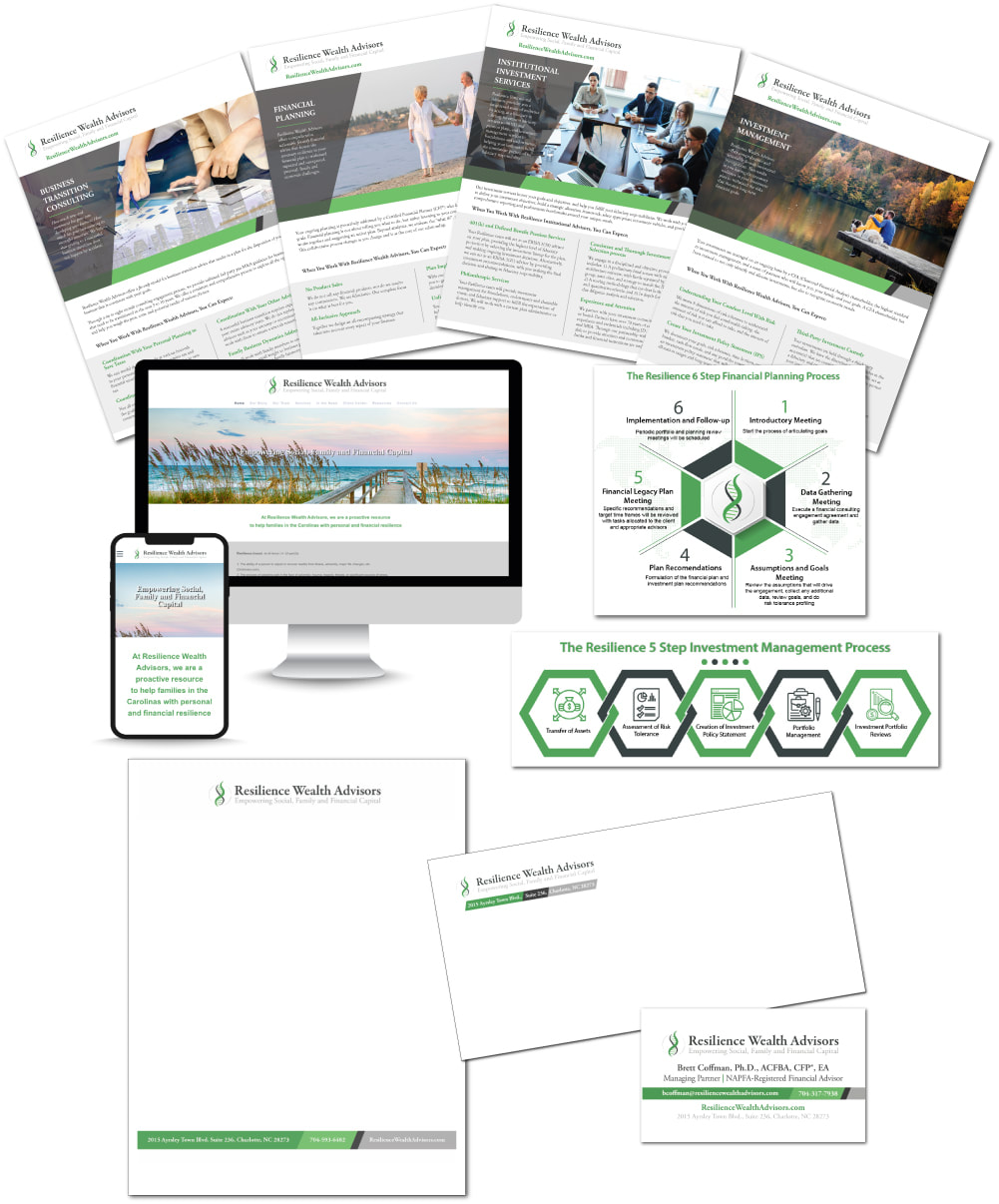
Resilience Wealth Advisors, a newly established RIA with three partners, came to Impact Communications with a vision for what their company brand and website should look like in order to align with their mission, values and ideal clients. The partners had very specific reasons for asking us to use a helix as their brandmark, which was subsequently custom-drawn by one of Impact’s skilled illustrators. The color palette and photos are intentionally calm and serene for a reason. By the end of the project, we had created not just their logo but an entire suite of collateral materials, a beautiful new website, and a social media presence to match. Visit the website here.
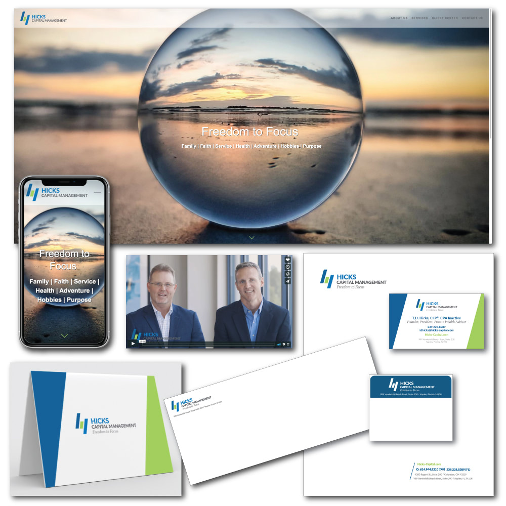
Hicks Capital Management, based in Columbus, Ohio and Naples, Florida, is dedicated to taking care of clients so that they have the freedom to focus on what’s important in their lives. Using the focus metaphor, Impact developed a brand identity, website, social media and videos that visually, and through text, reflect the firm’s Midwest values. Using bright, contemporary colors, elements of the simple logo is carried throughout all of the marketing collateral. View Hicks Capital Management site here.
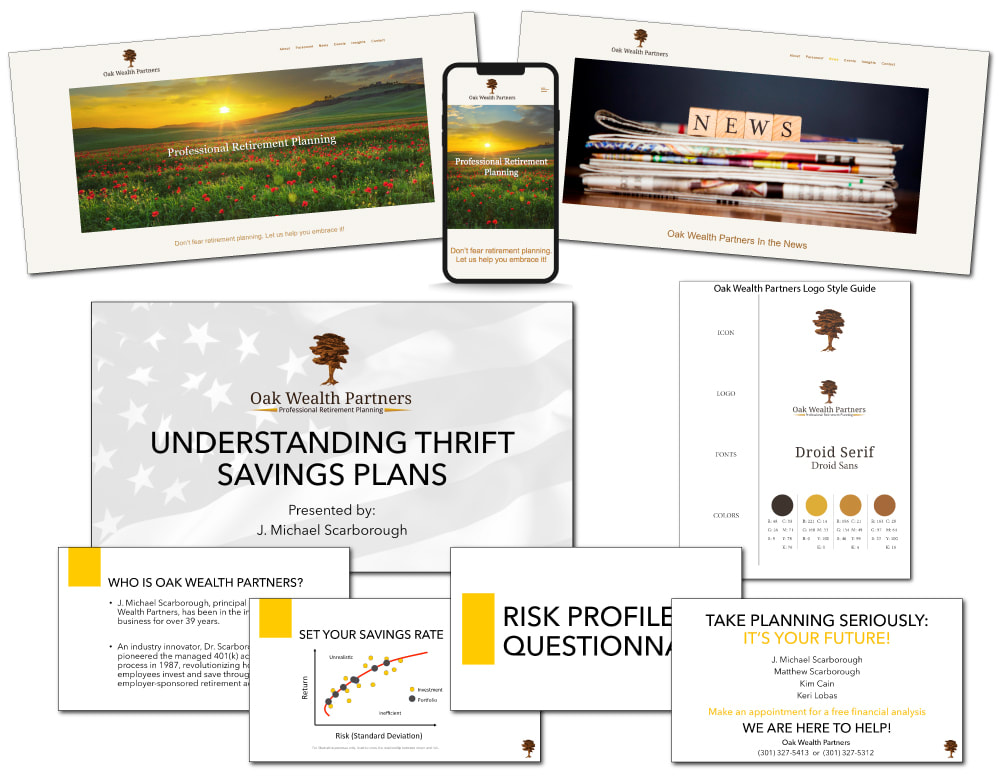
Oak Wealth Partners, an established RIA with a respected thought leader at the helm, came to Impact Communications because their logo and website, as well as their corresponding collateral materials, were old and dated. The marketing team determined that a warm color palette and photos would appeal most to the mass affluent clientele that Oak has continued to attract for 20+ years. We commissioned an illustration to replicate a piece of driftwood that the firm had been using as a focal point in the main lobby wall; this ultimately become the brand mark in the new logo. We worked on the messaging and provided some media opportunities as well. Visit the website here.
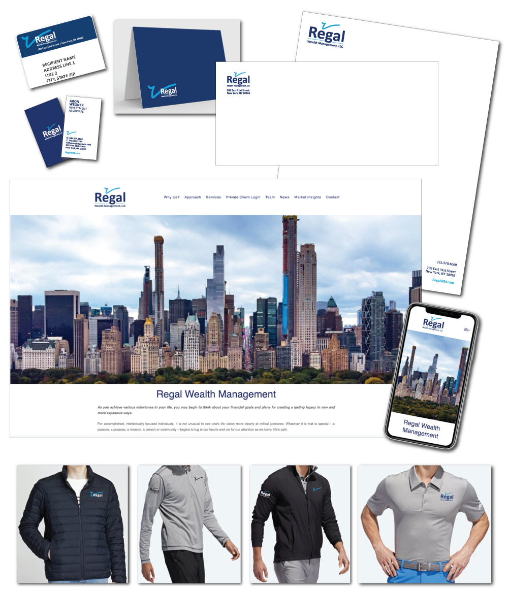
This New York firm wanted a simple, elegant logo and a clean look for its website, social media and collateral materials. Using the lower case “r” as a brandmark, in a bright turquoise, the contemporary design is impressive and memorable. The website images, including the New York skyline on the Home page, reflect the cosmopolitan profile of Regal’s clients who are drawn to the firm from across the country. View Regal Wealth Management site here.
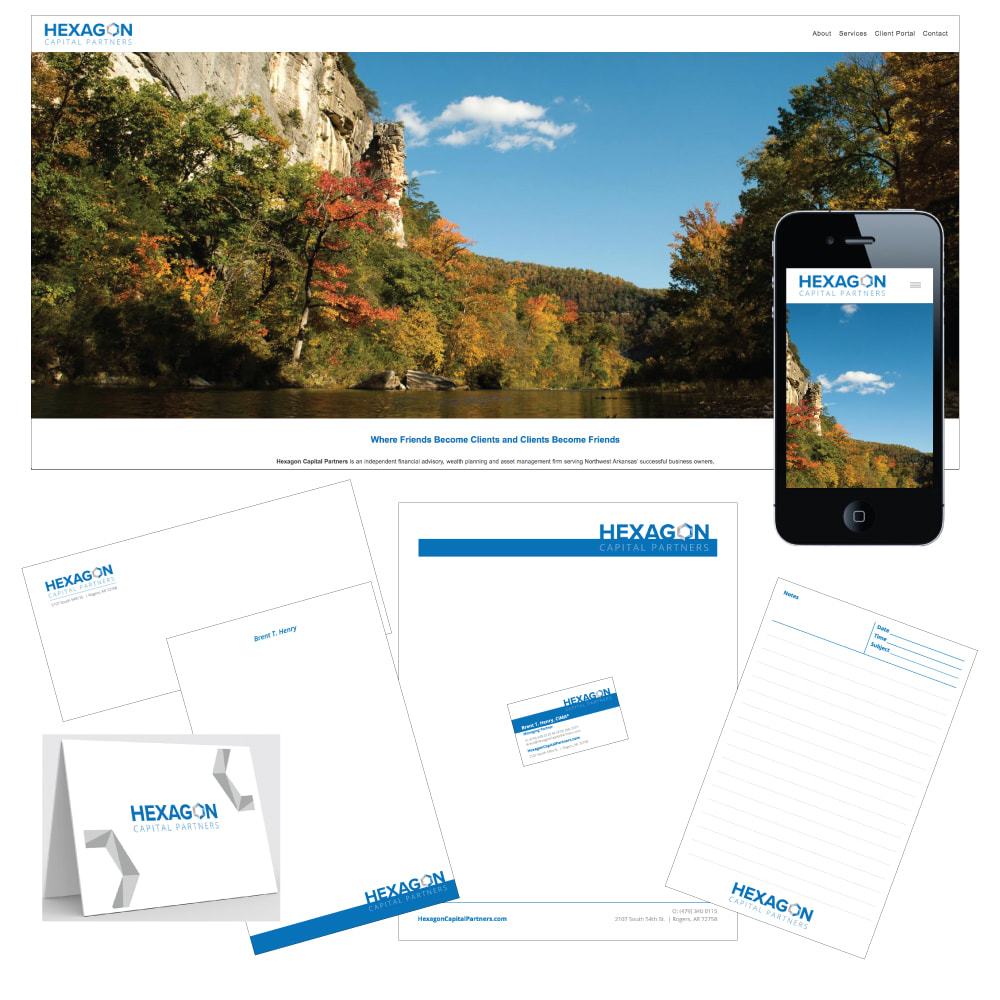
The professionals at Hexagon Capital Partners in Rogers, Arkansas, were well known in their community and wanted their logo to reflect their six-person team and for their website to showcase their Northwest Arkansas roots. Using banner photos of well-known lakes, hills and a beloved university, the website reflects the beauty of the region in addition to the experience and expertise of the firm. With the brandmark embedded in the font treatment used for the firm name, the logo uses the strong blue of the Arkansas sky with the nuances of color representing the customized approach to each and every client. Visit the website here.
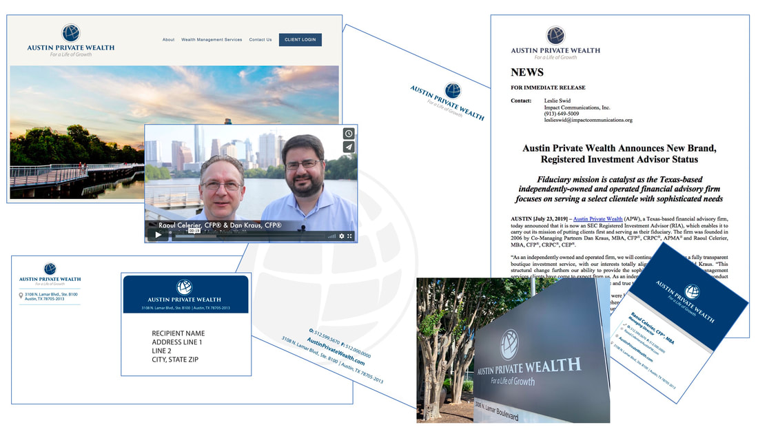
This Austin-based RIA is proud of their roots and hometown but also proud to be world-traveled and globally influenced, believing that life is about continuous growth - values reflected in their logo and tagline. Throughout corresponding photos on the website, as well as an introduction video we filmed and produced for the homepage of their website, Austin landmarks are prominently featured. We also developed a full suite of updated stationery and collateral materials, business cards, a branded PowerPoint template, social media set up, news release, and more. See the video and website here.
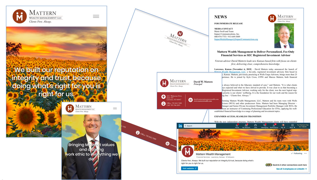
This Lawrence, Kansas-based advisor was eager to reflect his Midwestern roots and values in his website and marketing materials. The logo used a play on the initial from his name to also represent the valued relationships with clients. Using beautiful photos of open fields of flowers, wheat and corn, the website builds on the Midwest theme, which was also carried through his social media sites. The business cards and stationery benefited from the bold logo color and design. Visit the website.
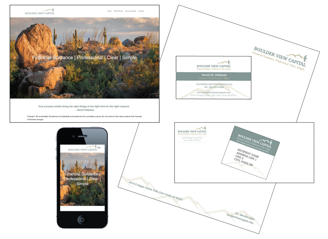
This newly-minted RIA located in Cave Creek, Arizona needed the essentials for their launch in 2020. After conducting a Vision Call with the two principals, Impact Communications created a beautiful new logo with a matching suite of stationery items, worked with them on the firm story and value proposition, created a website and stood up branded social media accounts that the principals will be able to maintain on their own. Check it out at www.BoulderViewCapital.com.
This website and matching brochure use vivid colors inspired by the company’s logo. The photos were carefully selected in partnership with this large independent wealth management firm to visually communicate the types of people this Austin-based RIA continually attracts. This firm has a marketing committee that votes on company messages and imagery, so a consensus building process was used to bring everyone into agreement on just the right balance of bold and traditional. We also developed a full suite of updated stationery materials, a branded PowerPoint template, social media set up, and more. See the brochure.
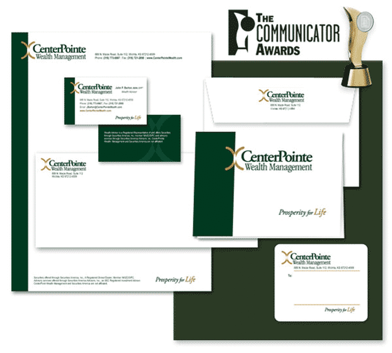
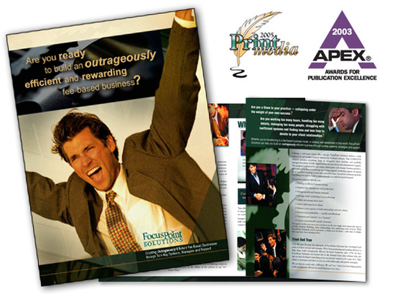
John Barton had been successful for over twenty years but knew his new Wealth Management focus required a unique and elegant brand. After in-depth branding conversations with Impact Communications, John established CenterPointe Wealth Management. Everything from the company name to the tagline, the logo, stationery and brochure reinforces John’s client-centered philosophies. The print pieces were designed to reinforce the concepts through the placement of the brandmark on a split field of solid and negative space. This stunning suite of materials, the recipient of a Print Media Award of Excellence (the highest award possible) in The Communicator Awards 2008, this identity package is quality design and aptly represents the professional talent available to you through Impact Communications. See brochure.
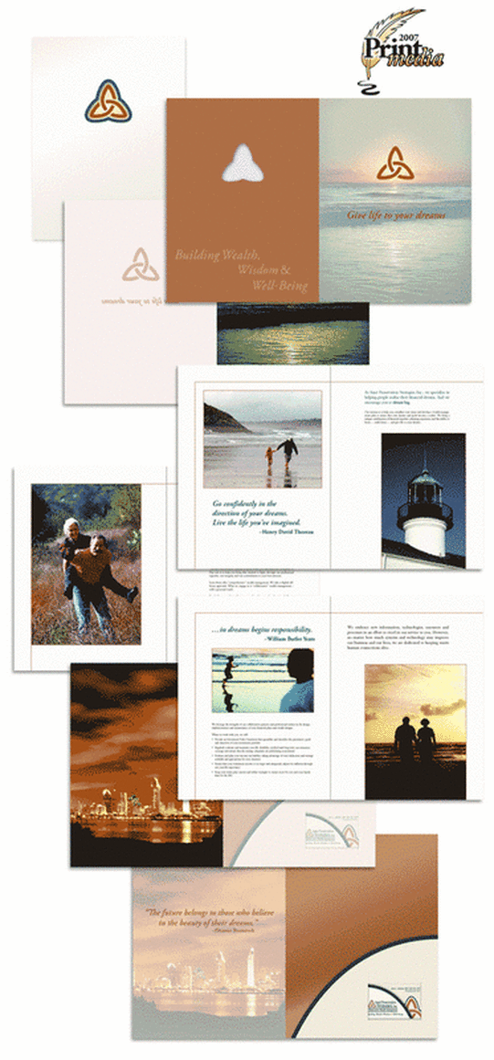
This elegant brochure incorporates the use of three distinct papers, custom die cutting, metallic ink, and carefully chosen photographs. The strategic use of white space connects not only with the intellect of the reader but also with the senses and sensibilities. The skilled design transforms the ordinary act of reading into an exquisite experience and reinforces the client-centered message expressed in the copy. In addition to this brochure Impact Communications also designed Asset Preservation Strategies’ logo and tagline, along with a full suite of matching stationery items.
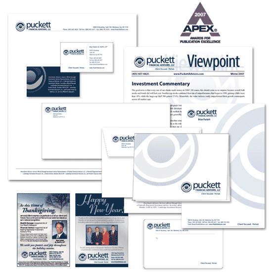
When Brian Puckett decided to improve his firm’s visual brand, the Impact team was happy to partner with this long-time client. After a lengthy “brand identity” conversation, we determined a new tagline and visual direction. We then designed the new logo and applied the branding elements throughout all his print and online materials including: business cards and matching stationery items, newsletters, magazine ads, a PowerPoint template and Web site.
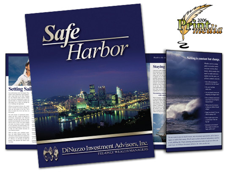
This oversized brochure uses a sailing theme to drive the message. It also ties the imagery to a local landmark – the harbor. This boutique wealth management firm competes with big institutional players and, until the creation of this piece, lacked the proper positioning. Now they can go toe-to-toe with their deep pocket competitors – and win. We also developed a full suite of updated stationery materials, fancy email signatures, branded Powerpoint template, and more. See the brochure.
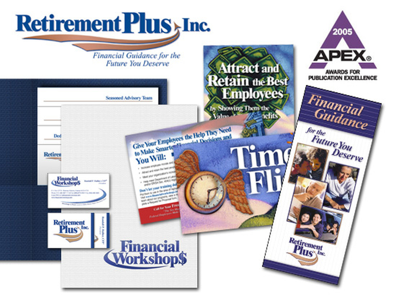
Impact Communications enjoyed the challenge of revamping two identities – Retirement Plus, Inc. and Financial Workshops LLC – in a way that best presented the sister organizations to their target clients. The look is still coordinated and put together. After 15 years in the business, the logos and collateral materials they had were old and tired – now they are vibrant and alive. Read the Retirement Plus brochure.
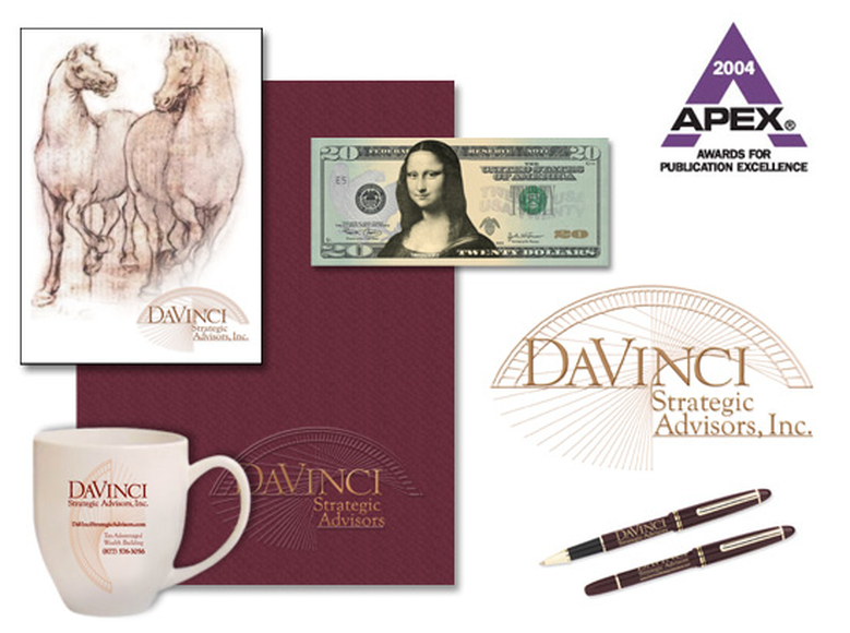
This APEX award-winning campaign included creating the firm’s brand from the ground up. Our team prepared invitations, activities, and gifts for the firm’s introductory event. Read more about the Creation of the DaVinci brand.
This business-to-business brochure is 9” x 12” with 6 1/2 panels. It is professionally printed, in full-color, with a heavy coating. The brand was extended through a full set of stationery, e-newsletters, postcards, advertisements and a custom Web site. An Impact-led national publicity campaign enhanced the firm’s reputation and visibility. See the brochure.
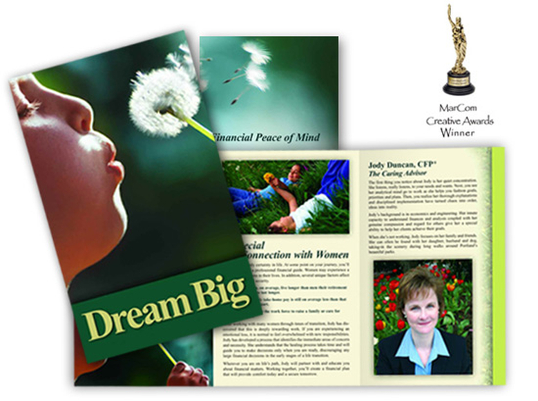
This client-centered brochure was developed to highlight the unique personality, qualities and skills of Certified Financial Planner™ professional, Jody Duncan. It has strong appeal to her ideal clients: women in transition. This personal brochure fits into the back of her parent company’s larger and more institutional brochure. See the Dream Big brochure.
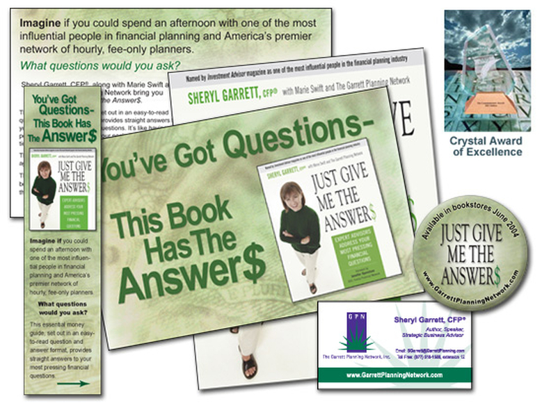
Marie Swift helped write, edit and bring this 337-page book to market. Coordinating and polishing 134 contributions from over 75 financial planners was no small feat. She and her team then developed and spearheaded a grassroots, national publicity campaign that utilized the enthusiasm of the 200+ planners in the Garrett Planning Network. Our efforts on this project earned a 2005 Communicator Awards top-tier Crystal Award of Excellence. Read the news release now.